
Go here for more information.
An experiment:
When the weekend rolls around, I'll post depictions of the same subject by two different artists and ask for comments or (even better!!) submissions for posts regarding their similarities/differences.
Something provocative, I sense, should kick things off. It's difficult to think of two more provocative works than these. Click on the images to enlarge them: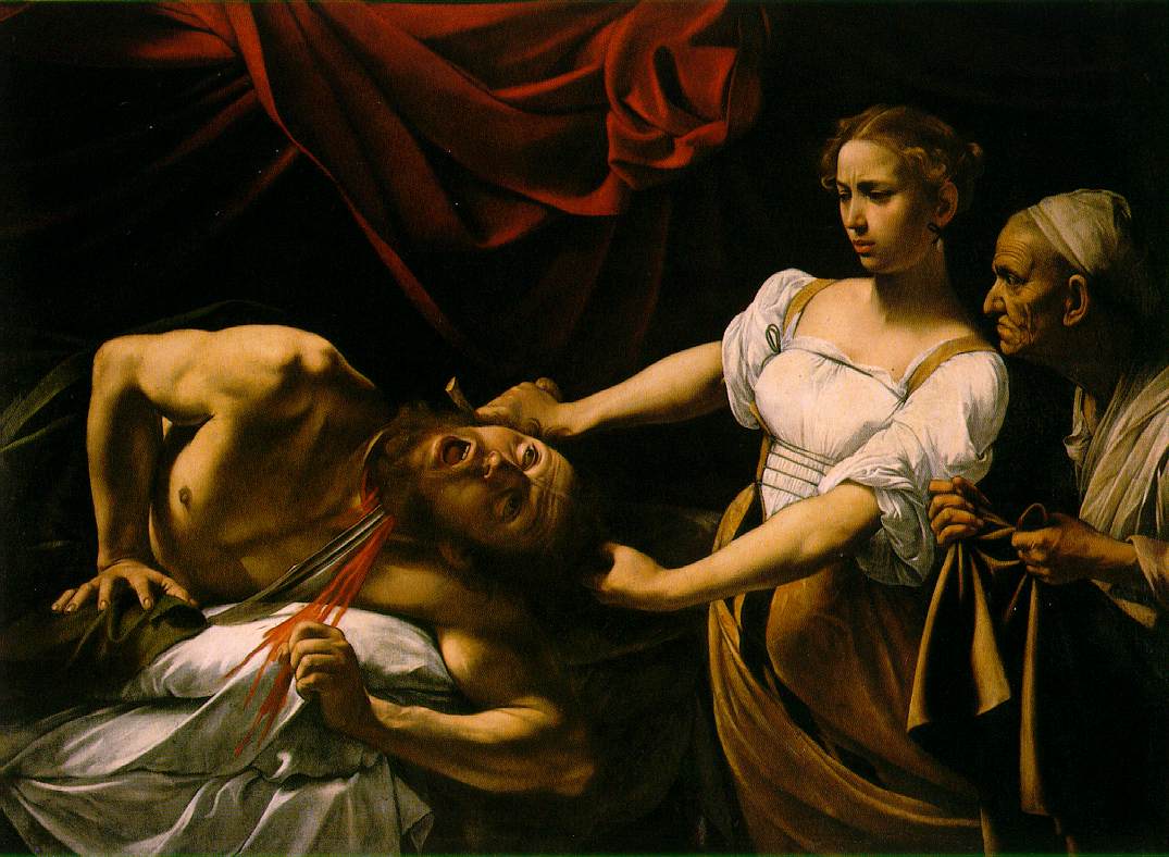 Caravaggio's Judith and Holofernes (ca. 1598)
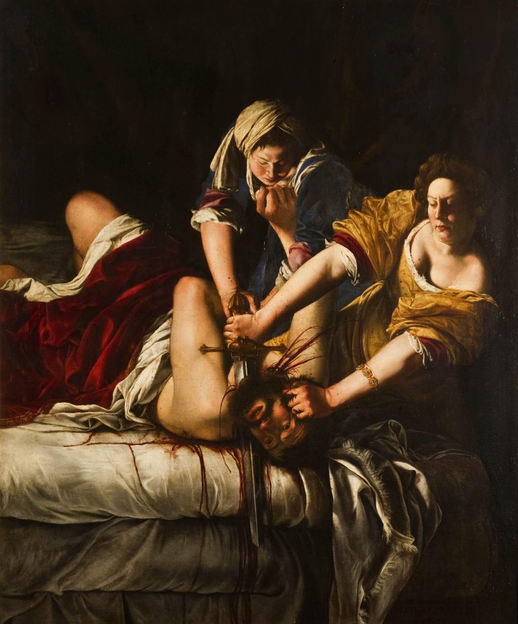 Artemisia Gentileschi's Judith and Holofernes (1612-21)
For a quick overview of the relevant events from the book of Judith (which, for my Protestant readers, is in the Apocrypha), here is the Wikipedia entry; and here are the texts of chapters 11, 12, and 13.

Jusepe de Ribera, The Martyrdom of Saint Bartholomew, 1634
The homepage of the National Gallery in Washington, DC, currently features an online exhibition of paintings from 17th-century Spanish painters. In addition to the Ribera you see above, the exhibition features works by Juan van der Haben y León, Zurbarán, Velázquez, and Murillo. All these paintings are presented beautifully and are well worth a half-hour or so of your time to see.
Other NGA online exhibitions of Baroque art and artists appear below the fold.
Rembrandt's work is featured in three of these exhibitions: an in-depth study of the etching, Abraham Entertaining the Angels, and two larger exhibitions, Rembrandt's Late Religious Portraits and Strokes of Genius: Rembrandt's Prints and Drawings.
A collection of genre paintings and portraits by Gerard ter Borch
And two in-depth studies of individual works: Johannes Verspronck, Andries Stilte as a Standard-Bearer, and Vermeer's Woman Holding a Balance
Amsterdam's home of some of the greatest paintings of the Dutch Baroque has what it calls the "Rijkswidget": it allows Mac and PC users to see a different painting from the collection each day.
Nifty . . . or it would be if, that is, my computer and the museum were on speaking terms--which they aren't, at the moment.
Correction: It's working now, and the first image is this one, Rembrandt's The Prophetess Anna.


Top: Bernini, Bacchanal: A Faun Teased by Children
Bottom: Poussin, Bacchanal before a Statue of Pan
Though not about Baroque art per se, Conrad Roth of Varieties of Unreligious Experience has up a thoughtful, closely-argued post addressing just these questions. Roth arrives at a couple of (for me) surprising conclusions, the money quotes of which are below.
Roth notes that, traditionally, painting has been held in higher regard than sculpture because art criticism tends to work from reproductions--engravings or drawings--and paintings naturally will suffer less from 2-dimensional renderings than sculptures will. But consider this:For [Johann Gottfried] Herder, . . . mere visual sensation is inadequate to an understanding of space, and therefore of Being: 'sight is but an abbreviated form of touch. The rounded form becomes a mere figure, the statue a flat engraving. Sight gives us dreams, touch gives us truth'. Sculpture is greater than painting because it is not confined, as painting is, to the image, to the eye—in Platonic terms, its subject is truth, not dreams or impressions. It cannot be reduced to a series of views, 'dismembered into a pitiful polygon'. Where the painter merely depicts, the sculptor, like God fashioning Adam, creates. The spiritual power of sculpture, as Herder explains towards the end of his treatise, is witnessed by primitive idol-worship; the ancients were aware, he thinks, that the statue must always be an image of the soul, of the world of Forms, bodied forth.
But then Roth expresses his own preference in sculpture for "the unfinished, fragmentary and deliquescent," becausein being (or appearing) incomplete, these sculptures call into question the primacy of the eye. If visual beauty arises from perfect form, these works decline such standards; rather they invite the mind to complete them—what Gombrich called the 'beholder's share'. The intellect, not the eye, is entertained. And this intellectual sculpture, this 'virtual' sculpture, cannot be considered in terms of views or images, not even three-dimensional ones. It cannot even be visualised—to do so is to compromise, to break the spell, just for a moment. It is, in fact, very much like another sort of intellectual construction: the castle of words, which must, again, remain ever incomplete.
Is it any surprise, then, that I, who prize the intellectual above the visual, the unseen above the seen—I, who greedily want my share of the work—should prefer the history of art to art itself?
I personally don't know how to articulate where I stand on these matters, but I'll give it a preliminary try.
I do know that I find it harder intellectual work to look at sculptures than at paintings, just as Leonardo himself argues in his Treatise on Painting (Aside: imagine the strange pleasure of being able to say one thinks like that genius, at least in that regard). Whereas painting creates a virtual space into which the viewer enters, sculpture enters into the viewer's space, becoming quite literally a physical presence that the viewer has no choice but to negotiate at the most basic of levels. The Abstract Expressionist painter Ab Reinhart's quip, "Sculpture is something you bump into when you back up to look at a painting,” indirectly makes that very point.
As for "art or art history," I suppose this blog's existence is a partial answer to that question: If I truly privileged art over art history, I'd either be silent or take some art classes and try to produce some Art myself. But as I read Roth's post some rather unpleasant memories from my grad school days came to mind, memories of times when among my peers it seemed as though theory-for-theory's-sake seemed to matter more than its efficacy when employed in reading actual texts--or, for that matter, that theory lead us back to rather than away from the text. I feel certain, based on my reading of his blog, that Roth's goal is to lead back to the work, equipped with his insight into it. I claim no insights or special knowledge; all I claim, really, is the desire to become better at articulating what I see when I look at these works. Knowing some unsuspecting soul might stumble upon these posts, I try to make his/her accidental visit here as worth his/her time as I am able--not as regards me, though, but as regards the work I'm commenting on. Isn't that all "art history" should do, really?
In its gallery, it is not front and center on the wall directly opposite the entrance, as you might expect. It hangs on one of the shorter walls, and then not even in the center of that wall. It's in a semi-shadowy corner, in fact, the sitter's white collar being the first thing to catch the visitor's eye there in its penumbra. (Note: the actual painting is not quite this dark.) You almost have to be looking for it to see it: an odd thing to say about a museum's choice in hanging a Rembrandt.
As a general rule, portraits leave me a bit cold. I don't know these people; why should they hold my attention? Of course, there are exceptions, and those I will happily stand in front of, trying to get to know them--it is, after all, as though they have introduced themselves to me, rather than myself to them. I think that's the initial paradox of this painting for me: off in the corner like a wallflower in the Dutch Baroque gallery, as though intimidated by the older, more-worldly man in the 3/4-length Hals in the same room, it's Rembrandt's young man that I want to spend time in front of. The Hals, as good as it is, is dead to me--just another portrait. No offense, sir. Even so, the intensity of the young man's gaze is such that I have to move away from it for a while and then come back to it.
Why is that?
As you can see, information is sketchy as to the sitter's identity or his precise station in life. Whoever this man is, he is just starting out on the adventure called adulthood. Not so his painter, though: Rembrandt would be dead 3 years after painting this portrait. By this point in his life, he knows a thing or two about how to get his viewer to pay attention even to someone who has yet to make his way in the world, at the expense of his more-accomplished companions.
Part of the explanation is "just" technique, which the Nelson-Atkins' website mentions:Rembrandt has used the butt end of his brush to make incisions in the still-wet paint of the hair to provide a richer sense of texture.
This is certainly true, but it's not what I'm drawn to when I approach the painting for a closer look. What I notice is that Rembrandt also used that butt-end to create a slight depression in his subject's pupils, giving them a 3-dimensional quality. It's the sitter's white collar that initially catches my eye; it's his eyes that hold it.
Tiny wells, "just" minute displacements of pigments on the canvas, nevertheless draw me into the sitter's mind and heart and not just look at his face. I have no choice but to look at this fellow and take seriously his steady, quiet, confident optimism. Whether student, graduate or aspiring artist, Rembrandt certainly seems to take him seriously as well.
But here's where looking at this painting becomes not merely an aesthetic experience but a personal one for me. As so many have said regarding Rembrandt's self-portraits, the directness, the honesty of this fellow's gaze has the effect of not just regarding the viewer but implicitly putting a question to him/her: "And you? What have you to say about your spent time?" A good question, and one that, depending on the day, can be an uncomfortable one to consider. You can't rebut this fellow: he will always be quietly confident, optimistic, damn him. His life remains perpetually ahead of him. But what about yours?
What else to do, then, but promise to amend your life?
Randall Sherman of Musings from the Hinterland has up a friendly nod toward this blog (thank you, sir) and a pleasant remembrance of an exhibit of Rembrandt etchings at the St. Louis Museum of Art from last year. His choice of Rembrandt etching reminds me that I should probably be walking my dog instead of posting this. But never mind that.
Randall also posts a link to REMBRANDT:
life, paintings, etchings, drawings & self portraits, an attractive site by Jonathan Janson, who, I learned when I visited, is also responsible for the extraordinary site Essential Vermeer. But, good to know as that is, I learned after a little more poking about his site (sorry, Scruffy, we'll be going soon) that Janson is also a working artist whose work is powerfully influenced by Dutch Baroque art. Have a look in particular at these amusing but respectful Vermeer parodies.
In short, Janson's various sites are well worth the visit if you have read this far. I know that I'm looking forward to looking more closely.
I hear you, Scruffy. We can go now.
 The cathedral in Mexico City, begun in 1567.
Those interested in an introductory discussion of how the Baroque manifested itself in Latin America will benefit from reading "The Angel with the Arquebus: Baroque Art in Latin America" by Miguel Rojas Mix. The whole piece is well worth reading, but the following, the concluding paragraph, sums up nicely:Baroque art in Latin America is not a mere transposition of Spanish or Portuguese art. It is a hybrid art. And it embraces more than two cultures, for along with the Spanish tradition it received the Arab heritage in the form of the mudejar style. It is said that the Indian contribution is shown in a preference for a range of pure colours and in the use of abstraction in the portrayal of figures. But the Black influence can also be seen, both in the dark complexion of angels and Virgins and in the syncretism of African gods with the traditional Christian saints. A marvellously enriched style emerged from all these influences, the style of an art that was fundamental to a new world. Such is the art we know as "Latin American Baroque'.
Rojas Mix's article, by the way, originally appeared in the September 1987 issue of the UNESCO Courier, the entire issue of which (contents here) is devoted to discussions of Baroque art, architecture, music, literature and thought from throughout Europe and Latin America. If the titles of the articles are any indication, there's much to learn on those pages.
I'm one of those I-know-what-I-like-but-can't-quite-tell-you-why kinds of writers, but it seems to me that if I am going to have a blog devoted to one style of art I should try to articulate in some way why I want one--and why for Baroque art, a whole ocean and 300 years removed from my degree-conferred area of expertise (20th-century American literature). So, it seems appropriate to post some apologias here from time to time until I can whip up my own manifesto. What follows appears to me a very good way to begin that collection of apologias.
Richard John Neuhaus, in this brief review of R.A. Scotti's book Basilica: The Splendor and the Scandal of Building St. Peter's, quotes the following passage from that book: The Baroque is to art what opera is to music–the elevation of pathos; a spectacle of color, emotion, and drama; fantasy rising to frenzied ecstasy. Bernini’s Baroque was art designed to serve religion, and more specifically to serve the needs of the Counter-Reformation.

Whether it was contrived to meet a clear purpose or whether it was a spontaneous expression, it fulfilled the mandate of the resurgent Church. The static perfection of the Renaissance was the art of the elite. The hot, intense Baroque was art to move the masses. It was popular art in the truest sense–cinematic special effects without a camera lens.
The (in)applicability of this observation to the Dutch and Flemish Baroque artists is a topic for another day, but it's hard not to agree with its rightness when applied to the Italians. Equally spot-on is the notion of the (Italian) Baroque's intent to inspire religious fervor in the viewer.
Comments welcome, of course.
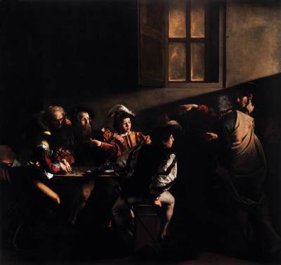
Rather than merely torture visitors to this blog with my own insipid observations about great works of art, I'll also be pointing them to folks much better at writing about these things than I am. One of those is John Berger, in this piece on Caravaggio. Below is his comment on one of my favorite Caravaggios, The Calling of St. Matthew (which Berger would later rewrite a bit for his book Ways of Seeing.
'The Calling of St. Matthew' depicts five men sitting round their usual table, telling stories, gossiping, boasting of what one day they will do, counting money. The room is dimly lit. Suddenly the door is flung open. The two figures who enter are still part of the violent noise and light of the invasion. (Berenson wrote that Christ comes in like a police inspector to make an arrest.)
Two of Matthew's colleagues refuse to look up, the other two younger ones stare at the strangers with a mixture of curiosity and condescension. Why is he proposing something so mad? Who's protecting him, the thin one who does all the talking? And Matthew, the tax-collector with a shifty conscience which has made him more unreasonable than most of his colleagues, points at himself and asks: is it really I who must go? Is it really I?
How many thousands of decisions to leave have resembled Christ's hand here! The hand is hold out towards the one who has to decide, yet it is ungraspable because so fluid. It orders the way, yet offers no direct support. Matthew will get up and follow the thin stranger from the room, down the narrow streets, out of the district. He will write his gospel, he will travel to Ethiopia and the South Caspian and Persia. Probably he will be murdered.
And behind the drama of this moment of decision is a window, giving onto the outside world. In painting, up to then, windows were treated either as sources of light, or as frames framing nature or an exemplary event outside. Not so this window. No light enters. The window is opaque. We see nothing. Mercifully we see nothing because what is outside is threatening. It is a window through which only the worst news can come; distance and solitude.

It's easy to become obsessed with Velázquez's magnificent painting. Speaking for myself, it first fascinated me on an intellectual level when I was introduced to it via Foucault's intricate discussion of it (here is an abstract) in the opening chapter of The Order of Things). The emotional connection came later: One day I realized that my younger daughter, when she was younger, is (or was) the spitting image of the Infanta Margarita, right down to the rather coy, even impish turn of the head.
For some time now, I've also been using this painting in classes to raise questions of just what happens when a viewer stands in front of a painting: Las Meninas, we come to realize, makes explicit what we tend to forget when we're looking at most paintings, that the painting creates a space into which the viewer enters vicariously. I've even used the painting as a way of trying to articulate the complicated reading and authorial perspectives in Mark Z. Danielewski's Baroque-styled postmodern novel, House of Leaves. That novel has a good bit of textual figure-ground confusions, just as Las Meninas, explicitly extending its space outward to include the viewer, creates more than a little disorientation in the viewer who contemplates it.
See what I mean?
All this is to say that it'd be very easy to keep a blog devoted just to this one painting. Indeed, I contemplated doing just that, once upon a time, but in the end I decided that that would be a wee bit excessive: I already use it enough in my teaching life that it doesn't need to have more room than it does here in my blogospheric life. This entry, which I'll also post a permanent link to over in the Sites of Interest, will eventually serve as both a happy medium and as, I hope, a service to others with an interest in this painting. As I and others run across sites that, to my mind, contribute to our thinking about Las Meninas, I'll add links to them here.
INTRODUCTIONS:
The Museo del Prado's in-depth look isn't as elaborate as one could hope for from the home for this painting, but what is here is just enough to intrigue the person who wants to know more. Its chief virtue is that it identifies all but one of the figures who appear and provides names of those who have offered various interpretations of it.
A more thorough introduction is the Wikipedia entry, with brief discussions of famous interpretations.
STUDIES AND INTERPRETATIONS:
"The Making of . . a Camera Obscura Prank: Ordinary Life as Visual Arts in Velázquez's Las Meninas" (pdf file). Argues that the painting documents simultaneously the staging and revelation of a camera obscura prank (a proto-Candid Camera scene, in other words).
"Velázquez: La Kabala y Las Meninas." An(other) extraordinarily-detailed study of Las Meninas' geometry and its possible significance for the painting's meaning. In Spanish.
"Velázquez's Las Meninas". Pays patient, close attention to the painting's geometry (with a nice compare/contrast to Leonardo's The Last Supper) that's blessedly free of the geometric excesses of some articles here (as below).
"Vermeer's Riddle Revealed". Despite the title, an application of grail geometry to Las Meninas.
ACCIDENTS, HOMAGES, PARODIES AND RECREATIONS:
Domingo Barreras
Camille of 327 Market
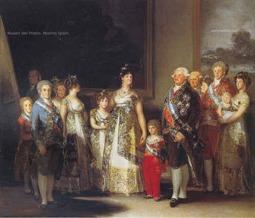
Francisco Goya
Las Meninas Information. A virtual-reality exploration of the space of the painting, along with intriguing suggestions as to astrological interpretations of the piece.
Edouard Manet (explanation here)
Pablo Picasso
Fairfield Porter
John Singer Sargent
Joel-Peter Witkin
 Welcome to visitors to this site, first and foremost. We hope you feel welcomed here and will feel that you have a home where you can indulge your tastes in these wonderful artists and their works. The virtual fatted calf is out back; we'll be bringing him round directly.
Two things:
The first is that, through trial and error, I think we have a Labels system that makes sense. As the blog grows, though, we'll have to work out some solution for its eventual unwieldy length. But that hasn't happened yet. First things first.
The other thing is that you can now subscribe to this blog's feed via FeedBlitz. This system allows you to receive e-mail notifications of updates to this blog: definitely a plus in these early days of this blog, given that it's not likely that lots of posting will be going on here. If you like what you find here, I hope you'll consider subscribing by clicking on this link and, even, using it for your own sites as an augmentation of whatever subscription service(s) you use.
So. That's that. I look forward to continuing to grow this blog my and others' contributions and your visits; I hope you'll come back and let others know about us.
UPDATE: A third thing, now: A slight adjustment to the title, from "Admirers of" to "Admiring." What matters more here is the act of admiring, not who is doing the admiring. So there.
UPDATED UPDATE: An enormous thank-you to Hackosphere for two elegant hacks for the not-so-Beta Blogger that this blog, I hope you'll agree, is benefiting from: one for expandable posts, and one that displays recent comments (this last being especially helpful because Blogger, once again, is NOT emailing me notifications when someone comments). Anyway, I strongly encourage those looking for these and other hacks for the new Blogger templates to try Hackosphere first.
Via Raminagrobis, this brief, sharply-observed post on two paintings by Rembrandt, Anna and the Blind Tobit and A Man Seated Reading at a Table in a Lofty Room, which hang in the same room in the National Gallery in London.
Solitude is the unifying theme of these two paintings. Tobit's blindness isolates him from his wife Anna, and he prays for death ("for it is profitable for me to die rather than to live […] turn not thy face away from me." Tobit 3:6). The reader (or is he a writer? Is that a pen in his left hand?) hunched over his desk, withdrawn fully within the ‘little world’ oblivious to those symbols of the ‘big world’ on the right: what looks like two globes, barely visible in the gloom. The function of the light here, it seems to me, is paradoxically not to draw the eye ‘outside’, but to involve it more deeply in the darkness.More follows, on the relationship between blindness and writing.
 Via Crooked Timber comes news that the Guardian has started a blog on the arts. In its inaugural post on art, Jonathan Jones has a post called "The works of art that matter most," its intention being the generation of a list of the 50 works of art one must see in person before dying. Jones kicks things off with his personal list of 20 works (the list and an accompanying slideshow are below the fold), and he solicits recommendations from his readers. He notes as a sort of pre-emptive strike that his list is exceedingly Euro-centric and Renaissance/Baroque-heavy; still, though, he says that these are the works that he alsways finds himself returning to--which, I suppose, would be the one criterion for works for this list. Not fame, not "beauty;" what works, finally, can you not get enough of, no matter how many times you see them?
Jones includes a Vermeer on his list, but my personal addition would be the one you see here, The Milkmaid. Long, long ago, I blogged about this painting, if you're curious, here and here in an attempt to get at why it may be my favorite Vermeer and one of my very favorite paintings, period.
Honestly, though, I'd have to think a bit before I add some others. I mean, we all have our personal favorites, but do we feel so strongly about them that we would have the temerity to insist to total strangers that they will be lesser human beings if they do not make time to see them in person? I'm pretty sure I can say that about The Milkmaid.
How about you? Jones is soliciting suggestions at his post, but you're welcome to comment here or, even better, take a hint from this post's title.
Below the fold, a slideshow and list of Jones's selections.
slideshow (Be warned that the order here doesn't correspond to that of the list below.)
Jan van Eyck, The Madonna of Chancellor Rolin, c.1435, Musée du Louvre, Paris
Caravaggio, The Burial of St. Lucy (1608), Museo di Palazzo Bellomo, Syracuse, Sicily
Rembrandt, Aristotle with a Bust of Homer (1654), Metropolitan Museum of Art, New York
San Rock Art, South African National Museum, Cape Town
Paul Cézanne, Mont Sainte-Victoire from Les Lauves (1904 - 6), Pushkin Museum of Fine Arts, Moscow
Michelangelo, Moses (installed 1545), Church of San Pietro in Vincoli, Rome
Leonardo da Vinci, The Adoration of the Magi, (c. 1481), Uffizi Gallery, Florence
Mark Rothko, The Rothko Chapel (paintings 1965-66; chapel opened 1971), Houston, Texas
Vermeer, View of Delft (c.1660-61), Mauritshuis, The Hague
Matthias Grünewald, The Isenheim Altarpiece (c.1509-15), Musée Unterlinden, Colmar, France
Hans Holbein, The Dead Christ, (1521-2), Kunstmuseum, Basel
Velázquez, Las Meninas (1656), Museo Nacional del Prado, Madrid
Funerary Mask of Tutankhamun (1333-1323BC), Egyptian Museum, Cairo
Jackson Pollock, One: Number 31, 1950, Museum of Modern Art, New York
Masaccio, The Expulsion of Adam and Eve from Paradise (c.1427), Brancacci Chapel, Santa Maria del Carmine, Florence.
Pablo Picasso, Guernica (1937), Reina Sofia Museum, Madrid
Titian, Danaë (c. 1544-6), Museo Nazionale di Capodimonte, Naples
Raphael, The School of Athens (1510-11), Stanza della Signatura, Vatican Palace, Rome
Parthenon Sculptures ("Elgin Marbles"), c. 444 BC, British Museum, London
Henri Matisse, The Dance (1910), Hermitage Museum, St. Petersburg, Russia
UPDATE: Here is the list of Jones's readers' Top 50 works.
 One of my favorite personal blogs is 327 Market, which I seem to recall having learned of via Ariel's blog, Bittersweet Life. The writer may or may not be named Camille, but for convenience's sake we'll assume it is. She lives and teaches art and publishes her own work in a place that in some way corresponds to the Bay Area but to which she's assigned her own place names. And she often includes marvelous pictures that she or friends of hers have taken. There's a whimsical, urban-fairy-tale-like quality to the world her blog documents that keeps me visiting and reading.
Context, context. Sorry. But way DOES lead on to way.
This morning I came across her most recent post, in which she describes the circumstances surrounding the accompanying picture. I'll not rehash all that; go read the whole thing, as we say here on the Internets. But what follows is most of my comment that I left there.I'll believe that you didn't plan it. The thing about Art, though, is that when the artist sees something in his/her work that wasn't planned but it improves the composition, s/he has the good sense to leave it in. It's harder to say this about Las Meninas (or painting in general) because of the medium, but it occurs to me now that the same rule applies--and that Velázquez is even commenting on it in his painting. On the left, the painter himself, palette and brush in hand, gazing at us with his critical, calculating painter's eye at the no-doubt-stiffly-sitting King and Queen . . . balanced on the far right by the little girl doing something I'm pretty sure she's NOT been asked to do.
There's more to say, of course, about the geometric connotations of that word "calculating," and some have done so to such an extent that I don't feel the need to. Besides: I'm more the "oh, look at the pretty picture!!" sort of viewer, anyway. So I'll just conclude this not-terribly-profound post by saying something else equally-lacking in profundity: Sure: Velázquez probably used grail geometry as a way of arranging the figures in this painting; so also, probably, did Vermeer. But, you know, so also, probably, did any number of Baroque-era painters, along with any number of poets of the time, along with Shakespeare and Donne and others you could find in your friendly neighborhood Norton Anthology, who wrote sonnets. To which I can only say, those features, those calculating frames are not why we keep looking at/reading certain people's work. There is something else, another sort of calculating, that exists beyond angles and rhyme schemes, the sort of sensibility that can see, in real life, a little girl's casual act of stepping on a dog and say, "That's going into a painting"--and then make it feel in Art like the casual act it originally was.
As an option for their research papers, students can write about some paintings of their choosing by a painter of my choosing: the idea (the hope, actually) is for them to choose paintings that have something in common and offer and support an opinion about what they think the painter wants to convey via this whatever-it-is that recurs in the paintings they've chosen. So today, I talked through how that might work by showing them three paintings by Velázquez (who, by the way, isn't on their list of painters). Two of them, Las Meninas and Venus at Her Mirror, I've posted images of before and so won't here, but the third one is  this one, The Supper at Emmaus. They are very different, to my mind, in terms of style, but what they have in common, and what we as a class have spent time discussing, is the presence of mirrors in each. We spend some time speculating as to why Velázquez has them in these paintings, functioning, as they do, as something more than mere detail; we've also meditated a bit on what mirrors themselves do and so begin to get at the implications of words such as "reflection" and "image." Ultimately, though, the goal has been simply to model for them how to get started on this task of writing about the paintings they've chosen.
Anyway, in the course of discussing The Supper at Emmaus this morning, a student said something interesting that I found interesting about a possible theological reading of the painting.
First of all, note that the event which gives the painting its title is depicted in the upper left-hand corner of the painting. Apparently, there's been some dispute among those who make a living at deciding such things over whether that scene is a painting hanging on the wall in the kitchen or is actually a mirror reflcting the activity in another room--the one we viewers would happen to be standing in; the consensus seems to be, now, that we're looking at a mirror.
Once I got all that out of the way, it suddenly occurred to me to ask something I'd not asked the other classes in which I've shown this painting: does it trivialize the event (Jesus' revealing Himself to his disciples after the Resurrection) to deliberately NOT make it the focal center of the painting? Compare, for example,  to one of Caravaggio's treatments of the same theme. A student immediately said No. When I asked him why, he said that the serving woman provides an implicit message about Christ himself: specifically, his humility ("The Son of Man came not to be served but to serve"). Also, there's something in the serving woman's manner--her looking down, the overturned dishes--that suggests a sort of rushedness to attend to the men, and should that not also be our response when guests arrive? So, then, the painting is really more about our response to the event than it is the event itself.
Now: Velázquez didn't paint many religious subjects. in his salad days in Seville, he had to to make a living, but when he became a court painter, he didn't have to except when asked to (aside: but then again, just how many paintings of a Prince Baltasar does a family need? 5 appear in the catalogue of the Velázquez exhibit that I own, and no doubt there are more). Though he'd have to be, publicly, Catholic, there's no way to know the depth of his faith. If his library is any indication, his reading tastes definitively tended toward the secular rather than the sacred. But it IS true that he is very thoughtful about his subjects, that he's not into simple picture-making but is eager to communicate some larger idea through certain canvases. It's equally true that the Church of the Counter-Reformation sought art that would engage its viewers on a more emotional, less cerebral level.
I think this painting reflects both Velázquez' thoughtfulness and that desire of the Church for its art. Making the serving woman the focal point has the effect of creating a sort of 3-dimensionality (one could call it "realism" for lack of a better term) for the viewer: while the acount in Luke mentions no one other than the two disciples, surely a woman served them their meal. And so Velázquez depicts her. But there's more than "mere" realism here: our attention is on this woman. We watch her actions and, surely, wonder what she is thinking. She becomes our stand-in in this scene, even as the mirror on the back wall causes us to stand in the space of the painting.
(Originally posted at Blog Meridian)
I should alert you from the beginning that what follows probably isn't going to set the art history world ablaze. It's just one of those "ah-ha!" moments that, for me at least, gives me a handle on thinking about a painter whose works I love and, as long-time readers know, have posted about before.
Doorsien is a Dutch word that literally means "plunge through." Here is a description of how doorsien works, from Karel van Mander's 1604 book, The Painter's Book:Our composition should enjoy a fine quality, for the delight of our sense, if we there allow a view [insien] or vista [doorsien] with small background figures and a distant landscape, into which the eyes can plunge. We should take care sometimes to place our figures in the middle of the foreground, and let one see over them for many miles. (quoted in Hollander, An Entrance for the Eyes: Space and Meaning in Seventeenth-Century Dutch Art, 8
In my Humanities class on Wednesday, I spent a little time talking about doorsien in relation to this painting by Pieter de Hooch, The Linen Closet. Those of you who actually click on the "Read More" buttons you see in the posts here might remember my having blogged about this painting not long ago.
More below the fold.
You can clearly see doorsien at work in this painting: the views through the windows and door allow the viewer's eye a passage through the foregrounded space out into, depending on our route, the larger world or into the neighbor's house across the street. As I was discussing it in class, I found myself remembering my first real in-person exposure to Dutch painting, this 2001 exhibition in New York, and being struck by how different the Vermeers looked from the paintings of his contemporaries. Everyone was there to see the Vermeers and I was too, but I hadn't seen many of them before, just a few of them, and that trip would serve as my introduction to the other painters. Many of the other paintings exhibited the same technical mastery that the Vermeers showed, and the subject matter was the same or very similar in each (the galleries were arranged thematically, the Vermeers not set apart from the others). But the Vermeers were easily identifiable, even from across the room. I had assumed before going that they would all look pretty much alike, but they could not be more different. What differed was Vermeer's treatment of these scenes, specifically his rendering of interior space. To be specific, Vermeer's contemporaries, more often than not, employed doorsien; Vermeer didn't.
Vermeer comes closest to employing doorsien in this painting,  A Maid Asleep.We can see through a door into another room and, on the opposite wall, the frame and barest edge of a mirror. That far room has light from a window coming into it but, as is typical with Vermeer's interiors, we can't see the window itself, much less what lies beyond it.
What's the effect of this? The space depicted in de Hooch's painting has a fluidity to it--for me, anyway, that space is so fluid that I find myself looking through the door and window as much as I do at the women and the small boy (yes--a boy, according to what I've read). For the viewer, the boundaries between interior and exterior are exceedingly blurred here. We note these people, find them pleasant enough, but that's about as far as it goes. In Vermeer's painting, all is interior. The eye isn't allowed to roam; we see, through the door, that there's not much to see except, via the mirror, that room and the room the maid is in, and so we don't worry about it anymore. So, we are compelled to contemplate the maid. And more: we wonder at her weariness, at her life. I find myself wondering just what the quality of her sleep is. I don't wonder at the quality of wakefulness of de Hooch's figures. Vermeer's maid's solitariness, the fact that the outside world is Outside, creates in this painting an intensity and, above all, an overwhelming sense of intimacy and privacy that the de Hooch just doesn't have. We are quiet; we don't want to disturb; we will tiptoe away quietly as soon as we're through contemplating. But that might not be for a while.
Somewhere in some online reading on doorsien a while back, someone wrote that it is such a prominent feature in Dutch painting because distinctions between public and private space were still very much in flux. Perhaps. But I personally don't think one has to look at too many of them before one realizes that Vermeer, at least, understood those distinctions very well.
(Originally posted at Blog Meridian)
UPDATE (May 3, 2007): Jonathan Janson of the most-excellent Essential Vermeer offers an extended reading of A Maid Asleep here.
Money quote:The premonitory quality of the painting might be supported by various iconographic and symbolic interpretations. The young girl's pose indicates that she is either asleep, in a state of drunkenness or afflicted by what was referred to in the seventeenth-century as melancholia. Artistic intuition has long been perceived as being feminine in nature, the nine muses of the arts are in fact, female. Melancholia, drunkenness and sleep have often represented the temporary suspension of the conscious mind which favors artistic creativity. Thus, the young girl who sleeps might be considered as the artist's creative unconscious whose power is alone capable of "opening the door" to newer and profounder artistic means of expression. A rather common dream in which the dreamer slowly passes from one room to others with which he is not yet familiar with, is usually interpreted by modern psychoanalysis as a becoming aware of ones latent and hitherto unexplored unconscious resources. The dimly lit dream-like atmosphere of the painting tends to confirm, on an esthetic plane, this symbolic interpretation.
I have been surrounded by art these past few days. On Friday, I led the discussion on the topic "The 'Work' of Art" that I mentioned a couple of posts below this one. Mrs. Meridian and I have begun to frame some posters that I've had for a couple of years and were threatening to become permanent cylinders. And a couple of days ago, Mrs. Meridian and I spent an enjoyable couple of hours at Bookaholic, a local used bookstore in Wichita. Among my finds was this Metropolitan Museum of Art exhibition catalogue of its 1989 Velazquez exhibition. Sorry, no pic available at Amazon, but the cover is a close-up of this painting,  Prince Baltasar Carlos as a Hunter. This catalogue is absolutely beautiful: great pictures, very informative text. And, hey: $12.
Long-time readers of this blog know that one painting in particular that I return to again and again (and not just in this blog, either) is Velazquez's Las Meninas. But, aside from Foucault's famous chapter on that painting in The Order of Things and a less-than-half-remembered biography of Velazquez for children that I read when I was in elementary school, I know very little about Velazquez. So, rather than remain like the "admirer" of someone's work who actually just knows the song that ALWAYS gets played on the radio, I snatched up the catalogue and have been reading through the introductory essays.
More below the fold.
But before I became as systematic as all that, I did what we all would do: I looked for the song that ALWAYS gets played on the radio. Las Meninas was not part of the Met's exhibition (it's hard to imagine that the Prado would ever let that painting leave), but, of course, it's mentioned throughout the text in relation to the works that did make the trip. So, as I looked for/at references to good ol' Las Meninas, one painting that caught my eye was this one, Venus at Her Mirror. I was immediately taken by it. Mrs. Meridian expressed her suspicion that it was the sumptuousness of Venus' body that had caught my eye, but that part became true only later. No: what had caught my eye was that we don't see Venus' face but its IMAGE, its reflection in the mirror that Cupid is holding up. Indeed, that's the center of Venus' attention as well as Cupid's--and it becomes what we contemplate as well, more so (for me, anyway, as I look at this painting) than her body. The mirror, note, is not quite at the center of the painting--what IS at the center is the bright-white sheet or towel that intervenes between the mirror and Venus' hip. The white of the towel draws our eye to it, and we gaze into the mirror as well.
And what do we see? The face of a beautiful woman, certainly. But it is also an IMAGE we see, and not HER. Somewhat as in Las Meninas, the mirror here works to incorporate the viewer into the space without directly showing us the source of the reflection we see in the mirror. Also, it stands to reason, just as the messages on the trailers of trucks remind the driver, if we can see the mirror, the person looking into the mirror can see us. Venus returns our (reflected) gaze even as we look at her.
So: is this painting a complex message about the nature of Love? That what we love about the beloved is an image as opposed to something "real" but that that delusion is a happy one--that, indeed, we are active participants in its creation?
(Originally posted at Blog Meridian. The comments at the original post are worth visiting for.)
Greetings.
I think this blog's title is self-explanatory as regards what its purpose is. The goal, though, may be less obvious. I hope this place will attract readers and (even better) contributors who know a little something about the subject and are willing to join in whatever conversations might emerge here.
The first few posts will be from my "home" blog, Blog Meridian, where I've shared some unlearned observations about, in particular, Vermeer and Velázquez in past posts. I hope someone will see them and say, "Heck--I can do better than that," and will drop me a line to that effect. I'll happily sign you up as a contributor.


